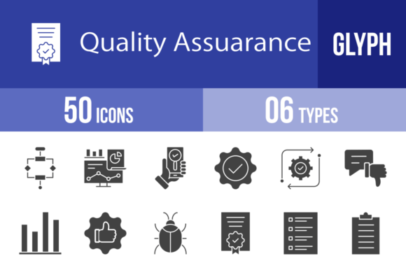
50 Quality Assurance Glyph Icons for Clear Communication
Why Visual Clarity Matters in Technical Design
If you've ever struggled to explain a complex testing process to a client or tried to make a software dashboard more intuitive, you know how powerful the right visual element can be. Words alone often fall short when describing something like "integration testing" or "bug tracking." That's where a dedicated icon set like the 50 Quality Assurance Glyph Icons steps in, offering a visual shorthand that communicates instantly.
This isn't just a random collection of symbols. It's a curated toolkit designed for the specific needs of anyone working in software development, app creation, or digital product management. The style is clean, consistent, and modern—think of it as the sans serif font equivalent in the icon world. Each glyph is built on a unigrid system, which means every icon shares the same visual weight, proportions, and optical balance. This consistency is crucial. When you place the "Bug Problem" icon next to the "Approved" checkmark in a status report or on a mobile app screen, they don't fight for attention. They work together as a cohesive system, creating a professional and trustworthy visual hierarchy.
Practical Applications Across Your Projects
The real value of these icons shows up in how you use them. For a mobile app developer, this set is a time-saver. Instead of designing custom icons for your settings menu, user feedback screens, or onboarding tutorials, you have ready-made symbols for "Settings," "Customer," "Satisfaction," and "Trust." They're optimized for small screens, meaning the details won't get lost or turn muddy at lower resolutions.
For those in editorial design or creating social media graphics, think about how you illustrate a blog post on "The Importance of QA." Using the "Checklist," "Tester," and "Performance" icons as inline graphics or section dividers breaks up text walls and guides the reader's eye. It makes technical content more approachable and shareable. The same principle applies to presentation design. A slide titled "Our QA Process" becomes far more engaging when accompanied by icons for "Routine," "Scripts," and "End To End" rather than bullet points alone.
Even in print and packaging design, these glyphs find a place. Imagine creating a quick-start guide for a physical product that includes software. Icons for "Laptop," "Phone," and "Update" can visually guide a user through setup steps without relying solely on language, which is invaluable for global audiences.
Integrating Icons into Your Brand Identity
Using a consistent icon set is a subtle yet powerful way to reinforce brand identity. If your brand is in the tech or SaaS space, incorporating these glyphs across your website, app, and marketing materials builds recognition. A customer who sees the "Guarantee" shield on your pricing page and later encounters the same visual language in your "Release" notes will subconsciously associate that consistency with reliability. It's a form of modern typography applied to imagery—creating a visual language that feels familiar and dependable.
When selecting icons, treat them like you would a premium font. Test them in context. Does the "Virus Scan" icon look clear next to your body copy? Does the "Rejected" symbol carry the right tone for your audience? Because these are 100% vector files in formats like SVG and AI, you have full creative control. You can adjust stroke weights to match your logo design or change colors to fit your brand palette without losing quality.
Think of this collection as more than just design assets. They are problem-solvers. They bridge the gap between technical jargon and universal understanding, making your projects more user-friendly and professionally polished. Whether you're building a dashboard, writing documentation, or crafting a marketing campaign, having a visual vocabulary for quality assurance at your fingertips ensures your message is not just seen, but clearly understood.